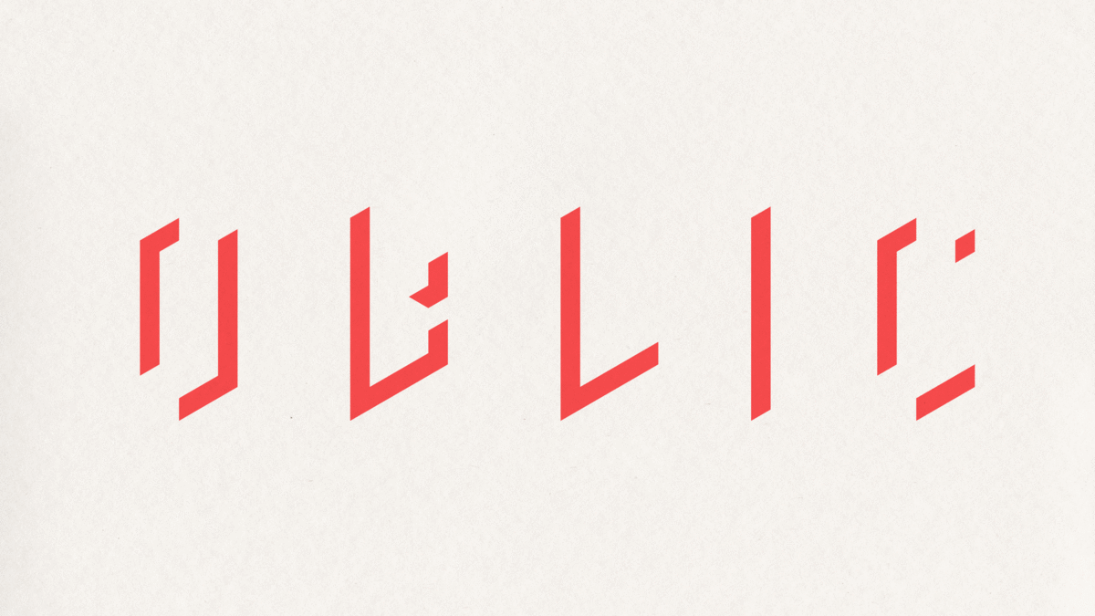
Oblic is the one-man-band of creative engineering. Perfectly poised at the junction of technical proficiency and artistic sensibility, Oblic offers complete mechanical design services, from ideation to fabrication, all under one roof. Their approach is lean, efficient, no-nonsense, and steeped in creativity — all thanks to their knack for looking at things... differently.

It makes sense for Oblic to practice what they preach when it comes to their own branding, too. The whole design process was highly collaborative, with 2D and 3D expertise enmeshed to produce a deceptively simple, single-colour logo. No extra fluff, no kinks, just a thoughtful, well-crafted product that works.


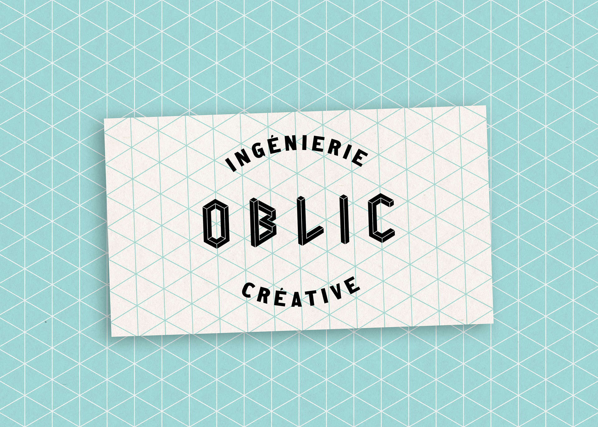
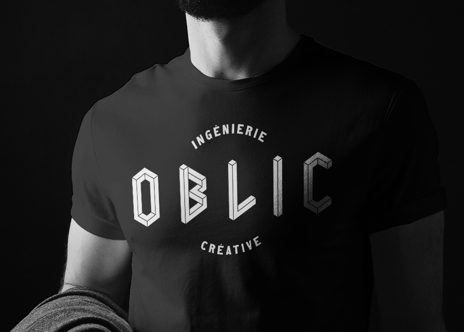
The visual identity plays on the mechanical/artistic contrast by pairing the finely engineered logo and its isometric grid with bold, characterful typography. The bright, unexpected colour palette and striking use of black and white offer further differentiation in a blandly corporate (and risk-averse) competitive landscape.
The result is a brand that is memorable, packed with personality, and shows just how rewarding adopting a fresh perspective can be.